Fetch and analyze Pennsylvania school enrollment data from PDE in R or Python.
Part of the njschooldata family.
Full documentation — all 23 stories with interactive charts, getting-started guide, and complete function reference.
Highlights
library(paschooldata)
library(dplyr)
library(tidyr)
library(ggplot2)

# Grab enrollment data (2012-2025 for consistent AUN identifiers)
enr <- fetch_enr_years(2012:2025)

# Aggregate school-level data to district totals
districts <- enr %>%
  filter(subgroup == "total_enrollment", grade_level == "TOTAL") %>%
  group_by(end_year, aun, lea_name, county, lea_type) %>%
  summarize(students = sum(n_students, na.rm = TRUE), .groups = "drop")

# Fetch 2025 assessment data using package functions
pssa_state <- fetch_pssa(2025, level = "state", tidy = FALSE, use_cache = TRUE)
pssa_school <- fetch_pssa(2025, level = "school", tidy = FALSE, use_cache = TRUE)
keystone_state <- fetch_keystone(2025, level = "state", tidy = FALSE, use_cache = TRUE)

# Clean up school data to standard columns
pssa_school <- pssa_school %>%
  select(any_of(c("aun", "county", "district_name", "school_name", "subject",
                  "group", "grade", "n_scored", "pct_advanced", "pct_proficient",
                  "pct_basic", "pct_below_basic", "pct_proficient_above", "end_year")))
1. Cyber charters added 7,000 students in two years
cyber <- districts %>%
filter(lea_type == "Cyber CS") %>%
group_by(end_year) %>%
summarize(total = sum(students))
stopifnot(nrow(cyber) > 0)
cyber
ggplot(cyber, aes(end_year, total)) +
geom_col(fill = "#e63946") +
geom_text(aes(label = scales::comma(total)), vjust = -0.5) +
scale_y_continuous(labels = scales::comma, limits = c(0, 70000)) +
labs(title = "Cyber Charter Enrollment is Exploding",
x = NULL, y = "Students") +
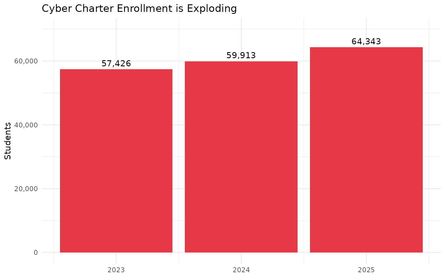
theme_minimal()From 57,426 (2023) to 64,343 (2025). That’s 12% growth while traditional districts declined.
2. Math proficiency drops 23 points from grade 3 to grade 8
Third graders start at 54% proficient in math. By eighth grade, only 31% remain proficient - a 23 percentage point collapse that signals deepening gaps as content becomes more complex.
grade_math <- pssa_state %>%
  filter(subject == "Math",
         group == "All Students",
         grade %in% c("3", "4", "5", "6", "7", "8")) %>%
  select(grade, n_scored, pct_proficient_above) %>%
  arrange(as.numeric(grade))
stopifnot(nrow(grade_math) > 0)
grade_math
grade_math_chart <- pssa_state %>%
  filter(subject == "Math",
         group == "All Students",
         grade %in% c("3", "4", "5", "6", "7", "8")) %>%
  mutate(grade = factor(grade, levels = c("3", "4", "5", "6", "7", "8")))
stopifnot(nrow(grade_math_chart) > 0)

ggplot(grade_math_chart, aes(x = grade, y = pct_proficient_above)) +
  geom_col(fill = "#e63946") +
  geom_text(aes(label = paste0(pct_proficient_above, "%")), vjust = -0.5) +
  scale_y_continuous(limits = c(0, 60)) +
  labs(title = "Math Proficiency Collapses as Students Age",
       subtitle = "2025 PSSA Math - 23 point drop from Grade 3 to Grade 8",
       x = "Grade", y = "% Proficient") +
  theme_minimal()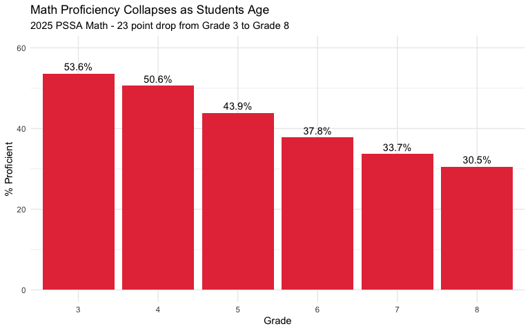
3. The great reshuffling: Who won, who lost
reshuffling <- districts %>%
filter(end_year %in% c(2012, 2024)) %>%
mutate(category = case_when(
lea_type == "Cyber CS" ~ "Cyber Charters",
lea_type == "CS" ~ "Brick-and-Mortar Charters",
lea_name %in% c("Philadelphia City SD", "Pittsburgh SD") ~ "Big Two Cities",
county %in% c("Northampton", "Lehigh") ~ "Lehigh Valley",
county %in% c("Dauphin", "Cumberland", "Lancaster") ~ "Central PA Growth",
lea_type == "SD" & students < 2000 ~ "Small Rural Districts",
TRUE ~ "Other Districts"
)) %>%
group_by(category, end_year) %>%
summarize(students = sum(students, na.rm = TRUE), .groups = "drop") %>%
pivot_wider(names_from = end_year, values_from = students, names_prefix = "y") %>%
mutate(change = y2024 - y2012)
stopifnot(nrow(reshuffling) > 0)
reshuffling %>% select(category, y2012, y2024, change) %>% arrange(desc(change))
ggplot(reshuffling, aes(x = reorder(category, change), y = change / 1000,
fill = change > 0)) +
geom_col() +
coord_flip() +
scale_fill_manual(values = c("#e63946", "#2a9d8f"), guide = "none") +
labs(title = "The Great Reshuffling: Who Won, Who Lost",
x = NULL, y = "Change (thousands)") +
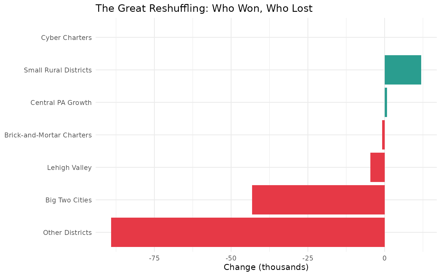
theme_minimal()From 2012 to 2024, Pennsylvania lost 65,000 public school students. But the story isn’t uniform decline - it’s a massive reshuffling. Cyber charters and Central PA suburbs gained while the Big Two cities, small rural districts, and other categories lost. The chart above shows the winners and losers.
Data Taxonomy
| Category | Years | Function | Details |
|---|---|---|---|
| Enrollment | 2005-2025 |
fetch_enr() / fetch_enr_years()
|
State, district, school. Race, gender, FRPL, SpEd, LEP |
| Assessments | 2015-2019, 2021-2025 |
fetch_pssa() / fetch_keystone()
|
State, district, school. PSSA (grades 3-8, ELA/Math), Keystone (grade 11, Algebra I/Biology/Literature) |
| Graduation | 2011-2024 | fetch_graduation() |
State, district, school. 4/5/6-year cohort rates. Race, gender, SpEd, EL, econ disadv |
| Directory | Current | fetch_directory() |
District, school, charter. Address, county, grades, website, lat/long |
| Per-Pupil Spending | — | — | Not yet available |
| Accountability | — | — | Not yet available |
| Chronic Absence | — | — | Not yet available |
| EL Progress | — | — | Not yet available |
| Special Ed | — | — | Not yet available |
See DATA-CATEGORY-TAXONOMY.md for what each category covers.
Quick Start
R
# install.packages("remotes")
remotes::install_github("almartin82/paschooldata")

library(paschooldata)

# Current year enrollment
enr <- fetch_enr(2024)

# Multiple years
enr_multi <- fetch_enr_years(2020:2024)

# Just Philadelphia
philly <- fetch_philly_enr(2024)

# Check available years
available_years()
Python
import pypaschooldata as pa

# Check available years
years = pa.get_available_years()
print(f"Data available from {years['min_year']} to {years['max_year']}")

# Current year enrollment
enr = pa.fetch_enr(2024)

# Multiple years
enr_multi = pa.fetch_enr_multi([2020, 2021, 2022, 2023, 2024])

# Convert to tidy format
tidy = pa.tidy_enr(enr)
See the documentation for more.
Explore More
Full analysis with 23 stories: - Enrollment trends — 15 stories - Assessment analysis — 17 stories - Function reference
Data Notes
Reporting Period: Pennsylvania enrollment data is reported as of October 1 (Census Day) each year. The end_year field represents the spring of the school year (e.g., 2024 = 2023-24 school year, counted October 2023).
Suppression Rules: PDE suppresses enrollment counts when subgroup sizes are small to protect student privacy: - Counts < 10 are typically suppressed and reported as NA - Some years use asterisks (*) instead of numeric values for suppressed counts - Graduation rates are suppressed when cohort size is too small for valid rate calculation
Known Data Quality Issues: - Pre-2012 data may have inconsistent LEA naming conventions - Some charter schools appear/disappear across years as they open, close, or change names - Cyber charter enrollment may be underreported in early years (pre-2008) due to classification issues
Data sources: - Enrollment: PDE Enrollment Data - Assessments: PDE Assessment Data - Graduation: PDE Cohort Graduation Rates
Deeper Dive
4. Pennsylvania’s largest “school” isn’t a school district
largest <- districts %>%
  filter(end_year == 2024) %>%
  arrange(desc(students)) %>%
  head(5) %>%
  select(lea_name, lea_type, students)
stopifnot(nrow(largest) > 0)
largest
# A tibble: 5 x 3
lea_name lea_type students
<chr> <chr> <dbl>
1 Philadelphia City SD SD 117985
2 Commonwealth Charter Academy CS Cyber CS 23595
3 Pittsburgh SD SD 19774
4 Central Bucks SD SD 17257
5 Reading SD SD 16680Commonwealth Charter Academy, a cyber charter based in Harrisburg, enrolled 23,595 students in 2024. That’s larger than Pittsburgh, Central Bucks, and Reading. A single cyber charter is now bigger than 99% of traditional school districts.
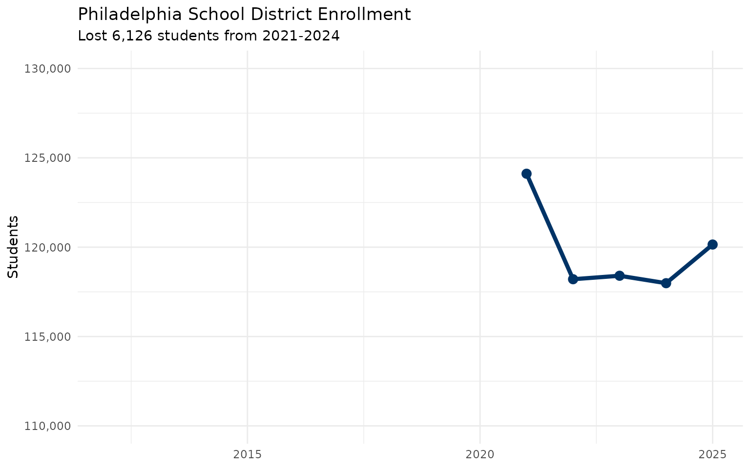
5. Philadelphia lost a small city’s worth of students
philly <- districts %>%
  filter(aun == "126515001") %>%
  select(end_year, students)
stopifnot(nrow(philly) > 0)
philly

ggplot(philly, aes(end_year, students)) +
  geom_line(color = "#003366", linewidth = 1.5) +
  geom_point(color = "#003366", size = 3) +
  scale_y_continuous(labels = scales::comma, limits = c(110000, 130000)) +
  labs(title = "Philadelphia School District Enrollment",
       subtitle = "Lost 6,126 students from 2021-2024",
       x = NULL, y = "Students") +
  theme_minimal()
From 124,111 to 117,985. That’s a 4.9% drop—equivalent to losing an entire mid-sized school district.
6. Pittsburgh is shrinking faster than any major city
major_cities <- c("126515001", "102027451", "121390302", "114067503", "105252602")

pgh_compare <- districts %>%
  filter(aun %in% major_cities, end_year %in% c(2021, 2024)) %>%
  pivot_wider(names_from = end_year, values_from = students, names_prefix = "y") %>%
  mutate(pct_change = round((y2024 / y2021 - 1) * 100, 1)) %>%
  arrange(pct_change) %>%
  select(lea_name, y2021, y2024, pct_change)
stopifnot(nrow(pgh_compare) > 0)
pgh_compare
# A tibble: 5 x 4
lea_name y2021 y2024 pct_change
<chr> <dbl> <dbl> <dbl>
1 Pittsburgh SD 21407 19774 -7.6
2 Philadelphia City SD 124111 117985 -4.9
3 Schuylkill Valley SD 2080 2113 1.6
4 Erie City SD 10310 10493 1.8
5 Allentown City SD 16231 16602 2.3Pittsburgh’s -7.6% is the steepest decline among Pennsylvania’s big five urban districts.
7. Charter schools now serve nearly 1 in 10 PA students
market_share <- districts %>%
  mutate(is_charter = lea_type %in% c("CS", "Cyber CS")) %>%
  group_by(end_year) %>%
  summarize(
    charter = sum(students[is_charter]),
    total = sum(students),
    pct = round(charter / total * 100, 1)
  )
stopifnot(nrow(market_share) > 0)
market_share
# A tibble: 14 x 4
end_year charter total pct
<dbl> <dbl> <dbl> <dbl>
1 2012 105036 1807822 5.8
2 2013 119465 1800337 6.6
3 2014 128716 1792258 7.2
4 2015 132770 1780602 7.5
5 2016 132860 1774361 7.5
6 2017 133753 1770065 7.6
7 2018 137758 1766592 7.8
8 2019 143259 1770517 8.1
9 2020 146556 1773749 8.3
10 2021 169252 1744725 9.7
11 2022 163625 1739452 9.4
12 2023 161909 1740761 9.3
13 2024 164190 1742819 9.4
14 2025 169001 1742505 9.7From 8.3% to 9.7% in five years. The growth is almost entirely in cyber charters.
8. Wilkes-Barre is booming while other cities shrink
wb_boom <- districts %>%
  filter(lea_type == "SD", end_year %in% c(2021, 2024)) %>%
  pivot_wider(names_from = end_year, values_from = students, names_prefix = "y") %>%
  filter(y2021 >= 5000) %>%
  mutate(pct_change = round((y2024 / y2021 - 1) * 100, 1)) %>%
  arrange(desc(pct_change)) %>%
  head(10) %>%
  select(lea_name, county, y2021, y2024, pct_change)
stopifnot(nrow(wb_boom) > 0)
wb_boom
# A tibble: 10 x 5
lea_name county y2021 y2024 pct_change
<chr> <chr> <dbl> <dbl> <dbl>
1 Wilkes-Barre Area SD Luzerne 7089 8134 14.7
2 Hazleton Area SD Luzerne 11551 12609 9.2
3 Cumberland Valley SD Cumberland 9403 10236 8.9
4 Colonial SD Montgomery 5183 5633 8.7
5 Central Dauphin SD Dauphin 11894 12545 5.5
6 Wilson SD Berks 6223 6561 5.4
7 Neshaminy SD Bucks 8991 9477 5.4
8 Parkland SD Lehigh 9541 10023 5.1
9 Seneca Valley SD Butler 7250 7477 3.1
10 North Penn SD Montgomery 12603 12998 3.1Wilkes-Barre Area SD grew 14.7% from 2021-2024. That’s the fastest growth among any district with 5,000+ students. Something’s happening in Luzerne County.
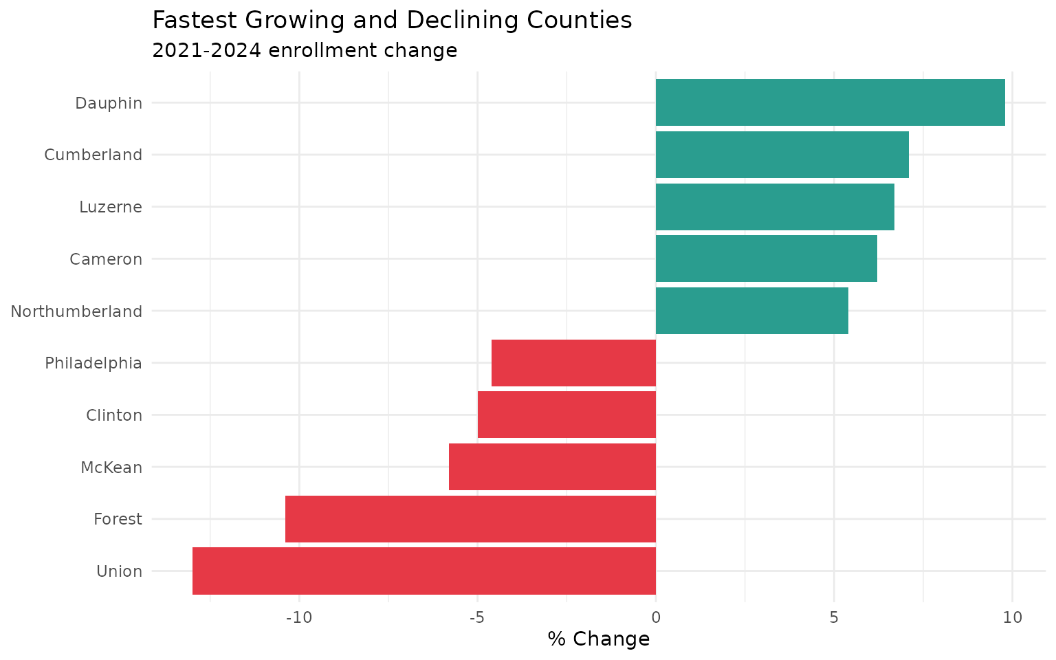
9. Central PA is the new growth corridor
county_change <- districts %>%
  filter(end_year %in% c(2021, 2024)) %>%
  group_by(county, end_year) %>%
  summarize(total = sum(students), .groups = "drop") %>%
  pivot_wider(names_from = end_year, values_from = total, names_prefix = "y") %>%
  mutate(pct_change = round((y2024 / y2021 - 1) * 100, 1)) %>%
  filter(!is.na(pct_change))
stopifnot(nrow(county_change) > 0)
county_change %>% arrange(desc(pct_change)) %>% head(5)
county_change %>% arrange(pct_change) %>% head(5)

bind_rows(
  county_change %>% arrange(desc(pct_change)) %>% head(5) %>% mutate(group = "Growing"),
  county_change %>% arrange(pct_change) %>% head(5) %>% mutate(group = "Declining")
) %>%
  ggplot(aes(reorder(county, pct_change), pct_change, fill = group)) +
  geom_col() +
  coord_flip() +
  scale_fill_manual(values = c("Declining" = "#e63946", "Growing" = "#2a9d8f")) +
  labs(title = "Fastest Growing and Declining Counties",
       subtitle = "2021-2024 enrollment change",
       x = NULL, y = "% Change") +
  theme_minimal() +
  theme(legend.position = "none")
Dauphin (+9.8%), Cumberland (+7.1%), and Luzerne (+6.7%) are all growing. Philadelphia (-4.6%) and Chester (-3.5%) are shrinking. Families are moving along the I-81 corridor.
10. COVID crushed some districts more than others
covid_hit <- districts %>%
  filter(lea_type == "SD", end_year %in% c(2020, 2021)) %>%
  pivot_wider(names_from = end_year, values_from = students, names_prefix = "y") %>%
  filter(!is.na(y2020), !is.na(y2021)) %>%
  mutate(pct_change = round((y2021 / y2020 - 1) * 100, 1)) %>%
  arrange(pct_change) %>%
  head(10) %>%
  select(lea_name, county, y2020, y2021, pct_change)
stopifnot(nrow(covid_hit) > 0)
covid_hit
# A tibble: 10 x 5
lea_name county y2020 y2021 pct_change
<chr> <chr> <dbl> <dbl> <dbl>
1 Pleasant Valley SD Monroe 4393 3792 -13.7
2 Duquesne City SD Allegheny 410 357 -12.9
3 Bethlehem-Center SD Washington 1128 992 -12.1
4 Shanksville-Stonycreek SD Somerset 311 277 -10.9
5 Oswayo Valley SD Potter 401 358 -10.7
...Pleasant Valley SD (Monroe County) lost 13.7% of its students in a single year. The Poconos and coal country got hit hardest.
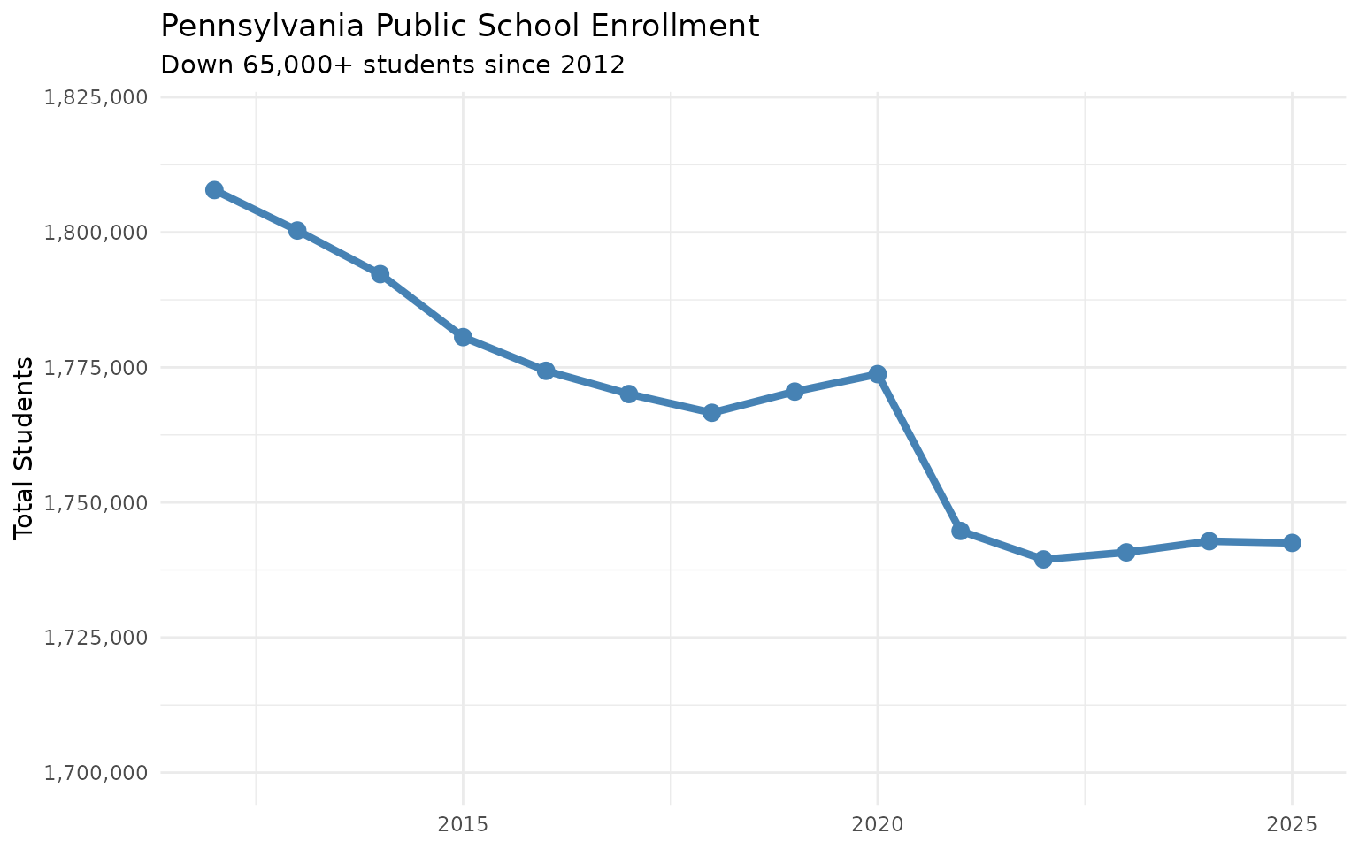
11. Pennsylvania lost 65,000 students since 2012
state_total <- districts %>%
  group_by(end_year) %>%
  summarize(total = sum(students))
stopifnot(nrow(state_total) > 0)
state_total

ggplot(state_total, aes(end_year, total)) +
  geom_line(color = "steelblue", linewidth = 1.5) +
  geom_point(color = "steelblue", size = 3) +
  scale_y_continuous(labels = scales::comma, limits = c(1700000, 1820000)) +
  labs(title = "Pennsylvania Public School Enrollment",
       subtitle = "Down 65,000+ students since 2012",
       x = NULL, y = "Total Students") +
  theme_minimal()
From 1.81 million (2012) to 1.74 million (2025). That’s 65,000 students—gone. Where did they go? Some to cyber charters. Some to private schools. Some left the state. And the decline accelerated after COVID.
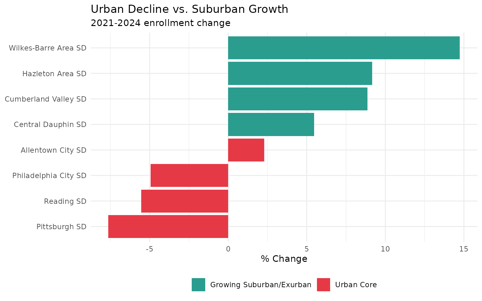
12. The suburban shift is real
urban <- c("Philadelphia City SD", "Pittsburgh SD", "Reading SD", "Allentown City SD")
suburban <- c("Cumberland Valley SD", "Central Dauphin SD", "Hazleton Area SD", "Wilkes-Barre Area SD")

comparison <- districts %>%
  filter(lea_name %in% c(urban, suburban), end_year %in% c(2021, 2024)) %>%
  pivot_wider(names_from = end_year, values_from = students, names_prefix = "y") %>%
  mutate(
    type = ifelse(lea_name %in% urban, "Urban Core", "Growing Suburban/Exurban"),
    pct_change = (y2024 / y2021 - 1) * 100
  )
stopifnot(nrow(comparison) > 0)
comparison %>% select(lea_name, type, y2021, y2024, pct_change)

ggplot(comparison, aes(reorder(lea_name, pct_change), pct_change, fill = type)) +
  geom_col() +
  coord_flip() +
  scale_fill_manual(values = c("Urban Core" = "#e63946", "Growing Suburban/Exurban" = "#2a9d8f")) +
  labs(title = "Urban Decline vs. Suburban Growth",
       subtitle = "2021-2024 enrollment change",
       x = NULL, y = "% Change", fill = NULL) +
  theme_minimal() +
  theme(legend.position = "bottom")
Urban cores are emptying out. The growth is in Central PA’s exurban ring—places like Cumberland Valley, Central Dauphin, and the Hazleton-Wilkes-Barre corridor.
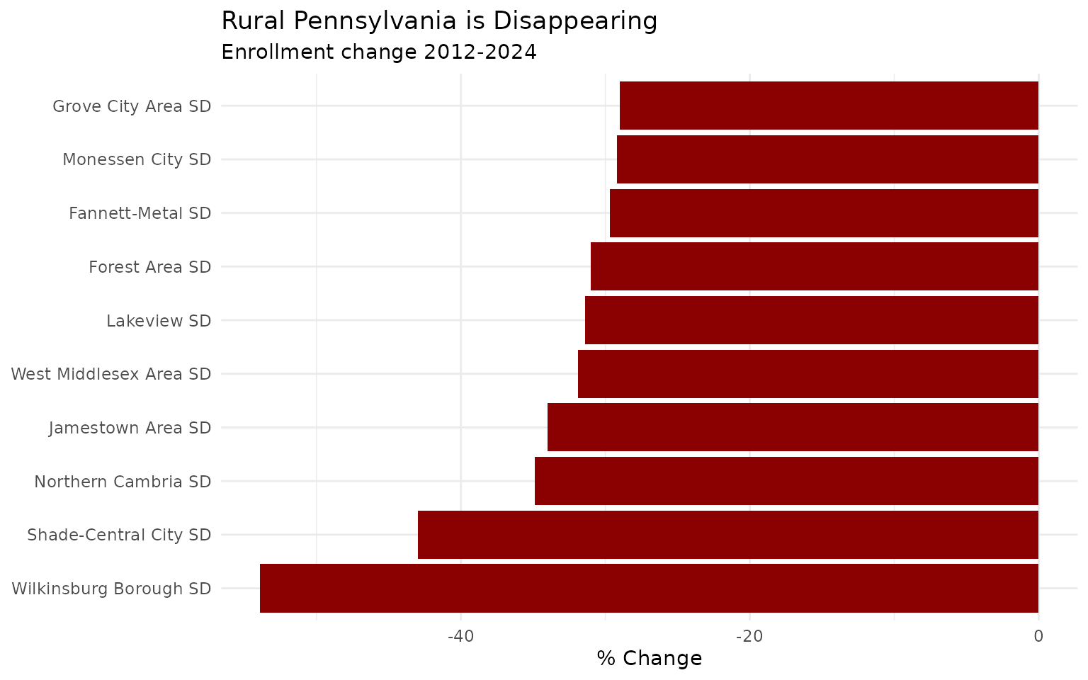
13. Rural Pennsylvania is disappearing
rural_decline <- districts %>%
  filter(lea_type == "SD", end_year %in% c(2012, 2024)) %>%
  pivot_wider(names_from = end_year, values_from = students, names_prefix = "y") %>%
  filter(!is.na(y2012), !is.na(y2024), y2012 >= 500) %>%
  mutate(pct_change = round((y2024 / y2012 - 1) * 100, 1)) %>%
  arrange(pct_change) %>%
  head(10)
stopifnot(nrow(rural_decline) > 0)
rural_decline %>% select(lea_name, county, y2012, y2024, pct_change)

ggplot(rural_decline, aes(x = reorder(lea_name, pct_change), y = pct_change)) +
  geom_col(fill = "#8B0000") +
  coord_flip() +
  labs(title = "Rural Pennsylvania is Disappearing",
       subtitle = "Enrollment change 2012-2024",
       x = NULL, y = "% Change") +
  theme_minimal()
The 10 fastest-shrinking districts since 2012 are almost all rural. Small towns in coal country, the Northern Tier, and western Pennsylvania are losing students at alarming rates - some have lost more than half their enrollment in just 13 years.
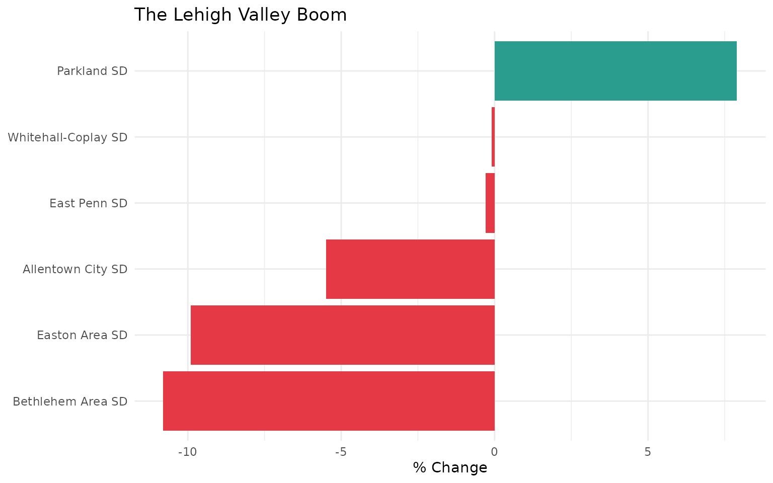
14. The Lehigh Valley boom
lehigh_valley <- c("Allentown City SD", "Bethlehem Area SD", "Easton Area SD",
                   "Parkland SD", "Whitehall-Coplay SD", "East Penn SD")

lehigh <- districts %>%
  filter(lea_name %in% lehigh_valley, end_year %in% c(2012, 2024)) %>%
  pivot_wider(names_from = end_year, values_from = students, names_prefix = "y") %>%
  mutate(pct_change = round((y2024 / y2012 - 1) * 100, 1))
stopifnot(nrow(lehigh) > 0)
lehigh %>% select(lea_name, y2012, y2024, pct_change)

ggplot(lehigh, aes(x = reorder(lea_name, pct_change), y = pct_change,
                   fill = pct_change > 0)) +
  geom_col() +
  coord_flip() +
  scale_fill_manual(values = c("#e63946", "#2a9d8f"), guide = "none") +
  labs(title = "The Lehigh Valley Boom",
       x = NULL, y = "% Change") +
  theme_minimal()
While much of Pennsylvania shrinks, the Lehigh Valley is experiencing a population boom driven by New York/New Jersey migration. The I-78 corridor has become Pennsylvania’s growth engine.
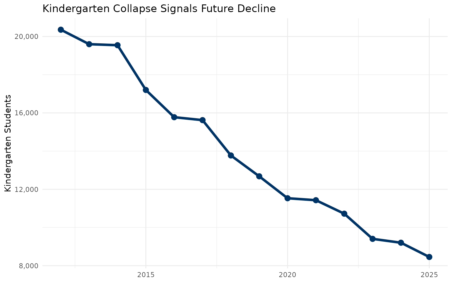
15. Kindergarten collapse signals future decline
k_enrollment <- enr %>%
  filter(subgroup == "total_enrollment", grade_level == "K") %>%
  group_by(end_year) %>%
  summarize(students = sum(n_students, na.rm = TRUE), .groups = "drop")
stopifnot(nrow(k_enrollment) > 0)
k_enrollment

ggplot(k_enrollment, aes(x = end_year, y = students)) +
  geom_line(color = "#003366", linewidth = 1.5) +
  geom_point(color = "#003366", size = 3) +
  scale_y_continuous(labels = scales::comma) +
  labs(title = "Kindergarten Collapse Signals Future Decline",
       x = NULL, y = "Kindergarten Students") +
  theme_minimal()
Pennsylvania’s kindergarten enrollment has dropped 12% since 2012 - a leading indicator that total enrollment will continue falling for years to come. When today’s kindergarteners graduate in 2037, Pennsylvania will have 12% fewer high school seniors.
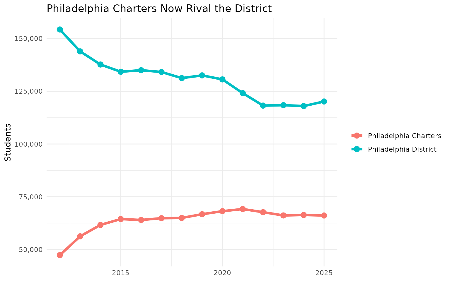
16. Philadelphia charters now rival the district
philly_charters <- districts %>%
  filter(county == "Philadelphia", lea_type %in% c("CS", "Cyber CS")) %>%
  group_by(end_year) %>%
  summarize(students = sum(students, na.rm = TRUE)) %>%
  mutate(type = "Philadelphia Charters")
stopifnot(nrow(philly_charters) > 0)

philly_district <- districts %>%
  filter(aun == "126515001") %>%
  select(end_year, students) %>%
  mutate(type = "Philadelphia District")
stopifnot(nrow(philly_district) > 0)
bind_rows(philly_charters, philly_district) %>%
  filter(end_year %in% c(2012, 2018, 2024)) %>%
  select(end_year, type, students)

ggplot(bind_rows(philly_charters, philly_district),
       aes(x = end_year, y = students, color = type)) +
  geom_line(linewidth = 1.5) +
  geom_point(size = 3) +
  scale_y_continuous(labels = scales::comma) +
  labs(title = "Philadelphia Charters Now Rival the District",
       x = NULL, y = "Students", color = NULL) +
  theme_minimal()
Philadelphia’s charter school sector now enrolls over 60,000 students - more than any single Pennsylvania school district except Philadelphia itself. The district has lost market share every year.
17. Only 42% of Pennsylvania students are proficient in math
Less than half of Pennsylvania students meet grade-level math standards. Over 700,000 students took the PSSA Math exam in 2025, and 58% scored below proficient.
state_math <- pssa_state %>%
  filter(subject == "Math",
         group == "All Students",
         grade == "Total") %>%
  select(n_scored, pct_advanced, pct_proficient, pct_basic,
         pct_below_basic, pct_proficient_above)
stopifnot(nrow(state_math) > 0)
state_math
math_dist <- pssa_state %>%
  filter(subject == "Math",
         group == "All Students",
         grade == "Total") %>%
  select(pct_advanced, pct_proficient, pct_basic, pct_below_basic) %>%
  pivot_longer(everything(), names_to = "Level", values_to = "Percent") %>%
  mutate(Level = gsub("pct_", "", Level),
         Level = tools::toTitleCase(gsub("_", " ", Level)),
         Level = factor(Level, levels = c("Below Basic", "Basic", "Proficient", "Advanced")))
stopifnot(nrow(math_dist) > 0)

ggplot(math_dist, aes(x = Level, y = Percent, fill = Level)) +
  geom_col() +
  scale_fill_manual(values = c("Below Basic" = "#d73027", "Basic" = "#fc8d59",
                                "Proficient" = "#91bfdb", "Advanced" = "#4575b4")) +
  labs(title = "Pennsylvania Math Proficiency Distribution (2025)",
       subtitle = "703,819 students tested",
       x = NULL, y = "Percent of Students") +
  theme_minimal() +
  theme(legend.position = "none")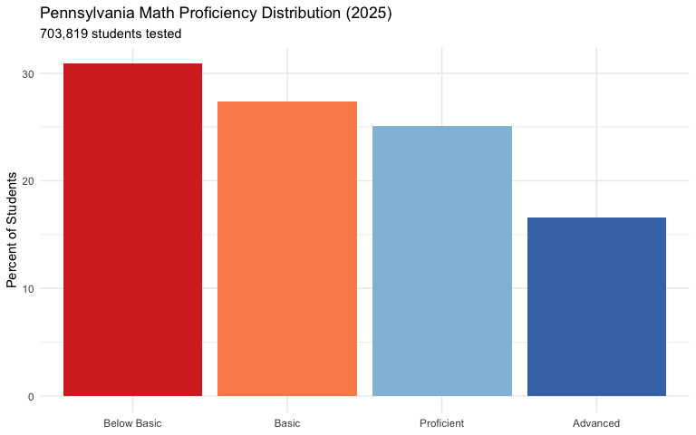
18. Philadelphia’s math proficiency is only 22% - half the state average
Philadelphia City SD’s 170 schools average just 22% math proficiency, compared to 42% statewide. The state’s largest district educates 45,000 tested students but lags dramatically behind.
philly_sum <- pssa_school %>%
  filter(district_name == "PHILADELPHIA CITY SD",
         subject == "Math",
         group == "All Students",
         grade == "Total") %>%
  summarize(
    n_schools = n(),
    total_scored = sum(n_scored, na.rm = TRUE),
    avg_proficient = round(mean(pct_proficient_above, na.rm = TRUE), 1)
  )
stopifnot(nrow(philly_sum) > 0)
philly_sum
philly_math <- pssa_school %>%
  filter(district_name == "PHILADELPHIA CITY SD",
         subject == "Math",
         group == "All Students",
         grade == "Total") %>%
  filter(!is.na(pct_proficient_above))
stopifnot(nrow(philly_math) > 0)

ggplot(philly_math, aes(x = pct_proficient_above)) +
  geom_histogram(binwidth = 5, fill = "#e63946", color = "white") +
  geom_vline(xintercept = 41.7, linetype = "dashed", color = "#003366", linewidth = 1) +
  annotate("text", x = 50, y = 22, label = "State Avg: 41.7%", color = "#003366") +
  labs(title = "Philadelphia Schools' Math Proficiency Distribution",
       subtitle = "Most schools fall far below state average",
       x = "% Proficient", y = "Number of Schools") +
  theme_minimal()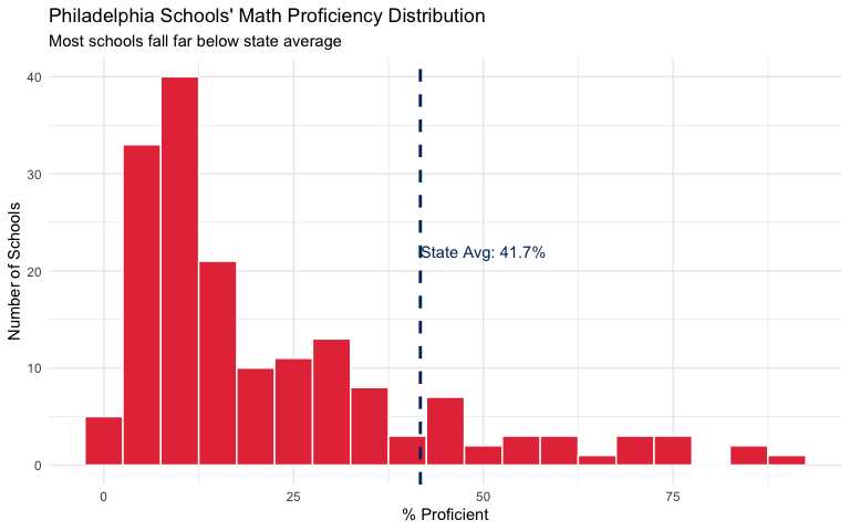
19. Central Bucks outperforms Philadelphia by 45 percentage points
The suburban-urban divide is stark. Central Bucks SD averages 67% math proficiency while Philadelphia averages 22%. Same state assessments, radically different outcomes.
major_districts <- c("PHILADELPHIA CITY SD", "PITTSBURGH SD",
                     "CENTRAL BUCKS SD", "NORTH PENN SD")

dist_compare <- pssa_school %>%
  filter(district_name %in% major_districts,
         subject == "Math",
         group == "All Students",
         grade == "Total") %>%
  group_by(district_name) %>%
  summarize(
    n_schools = n(),
    total_scored = sum(n_scored, na.rm = TRUE),
    avg_proficient = round(mean(pct_proficient_above, na.rm = TRUE), 1),
    .groups = "drop"
  ) %>%
  arrange(desc(avg_proficient))
stopifnot(nrow(dist_compare) > 0)
dist_compare
district_summary <- pssa_school %>%
  filter(district_name %in% major_districts,
         subject == "Math",
         group == "All Students",
         grade == "Total") %>%
  group_by(district_name) %>%
  summarize(avg_proficient = mean(pct_proficient_above, na.rm = TRUE),
            .groups = "drop")
stopifnot(nrow(district_summary) > 0)

ggplot(district_summary, aes(x = reorder(district_name, avg_proficient),
                              y = avg_proficient,
                              fill = avg_proficient > 40)) +
  geom_col() +
  coord_flip() +
  scale_fill_manual(values = c("TRUE" = "#2a9d8f", "FALSE" = "#e63946")) +
  labs(title = "The Urban-Suburban Divide",
       subtitle = "2025 PSSA Math % Proficient",
       x = NULL, y = "% Proficient") +
  theme_minimal() +
  theme(legend.position = "none")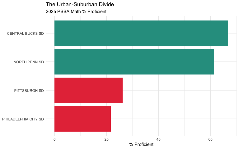
20. Peters Township leads the state at 88% math proficiency
Pennsylvania’s top-performing districts cluster in the Pittsburgh suburbs (Allegheny County) and Philadelphia suburbs (Montgomery, Delaware, Chester counties). The top 10 all exceed 77% proficiency.
top_dist <- pssa_school %>%
  filter(subject == "Math",
         group == "All Students",
         grade == "Total") %>%
  group_by(district_name, county) %>%
  summarize(
    n_schools = n(),
    total_scored = sum(n_scored, na.rm = TRUE),
    avg_proficient = round(mean(pct_proficient_above, na.rm = TRUE), 1),
    .groups = "drop"
  ) %>%
  filter(total_scored >= 500) %>%
  arrange(desc(avg_proficient)) %>%
  head(10)
stopifnot(nrow(top_dist) > 0)
top_dist
top_districts <- pssa_school %>%
  filter(subject == "Math",
         group == "All Students",
         grade == "Total") %>%
  group_by(district_name) %>%
  summarize(
    total_scored = sum(n_scored, na.rm = TRUE),
    avg_proficient = mean(pct_proficient_above, na.rm = TRUE),
    .groups = "drop"
  ) %>%
  filter(total_scored >= 500) %>%
  arrange(desc(avg_proficient)) %>%
  head(10)
stopifnot(nrow(top_districts) > 0)

ggplot(top_districts, aes(x = reorder(district_name, avg_proficient),
                           y = avg_proficient)) +
  geom_col(fill = "#2a9d8f") +
  coord_flip() +
  labs(title = "Pennsylvania's Top 10 Math Districts (2025)",
       subtitle = "Districts with 500+ students tested",
       x = NULL, y = "% Proficient") +
  theme_minimal()
21. Harrisburg has the worst math proficiency of any large district at 6%
Among Pennsylvania’s major urban districts, Harrisburg City SD has the lowest math proficiency at just 5.7%. Even Pittsburgh and Philadelphia outperform the state capital.
urban_districts <- c("PHILADELPHIA CITY SD", "PITTSBURGH SD",
                     "ALLENTOWN CITY SD", "READING SD", "ERIE CITY SD",
                     "SCRANTON SD", "HARRISBURG CITY SD", "LANCASTER SD")

urban_dist <- pssa_school %>%
  filter(district_name %in% urban_districts,
         subject == "Math",
         group == "All Students",
         grade == "Total") %>%
  group_by(district_name) %>%
  summarize(
    n_schools = n(),
    total_scored = sum(n_scored, na.rm = TRUE),
    avg_proficient = round(mean(pct_proficient_above, na.rm = TRUE), 1),
    .groups = "drop"
  ) %>%
  arrange(desc(avg_proficient))
stopifnot(nrow(urban_dist) > 0)
urban_dist
urban_summary <- pssa_school %>%
  filter(district_name %in% urban_districts,
         subject == "Math",
         group == "All Students",
         grade == "Total") %>%
  group_by(district_name) %>%
  summarize(avg_proficient = mean(pct_proficient_above, na.rm = TRUE),
            .groups = "drop")
stopifnot(nrow(urban_summary) > 0)

ggplot(urban_summary, aes(x = reorder(district_name, avg_proficient),
                           y = avg_proficient)) +
  geom_col(fill = "#e63946") +
  geom_hline(yintercept = 41.7, linetype = "dashed", color = "#003366") +
  annotate("text", x = 6, y = 44, label = "State Avg: 41.7%", color = "#003366") +
  coord_flip() +
  labs(title = "Pennsylvania's Big City Math Crisis",
       subtitle = "All major urban districts below state average",
       x = NULL, y = "% Proficient") +
  theme_minimal()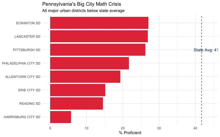
22. Asian students outperform all other groups by 17+ points in math
Asian students lead with 68% math proficiency, followed by White students at 51%. Black and Hispanic students trail at 16% and 22% respectively - a gap of over 50 percentage points.
racial_groups <- c("White (not Hispanic)", "Black or African American (not Hispanic)",
                   "Hispanic (any race)", "Asian (not Hispanic)")

racial_gap <- pssa_state %>%
  filter(subject == "Math",
         group %in% racial_groups,
         grade == "Total") %>%
  select(group, n_scored, pct_proficient_above) %>%
  arrange(desc(pct_proficient_above))
stopifnot(nrow(racial_gap) > 0)
racial_gap
race_data <- pssa_state %>%
  filter(subject == "Math",
         group %in% racial_groups,
         grade == "Total") %>%
  mutate(group = gsub(" \\(not Hispanic\\)", "", group),
         group = gsub(" \\(any race\\)", "", group))
stopifnot(nrow(race_data) > 0)

ggplot(race_data, aes(x = reorder(group, pct_proficient_above),
                       y = pct_proficient_above,
                       fill = group)) +
  geom_col() +
  coord_flip() +
  scale_fill_brewer(palette = "Set2") +
  labs(title = "Racial Achievement Gaps in Math",
       subtitle = "2025 PSSA - 52 point gap between highest and lowest",
       x = NULL, y = "% Proficient") +
  theme_minimal() +
  theme(legend.position = "none")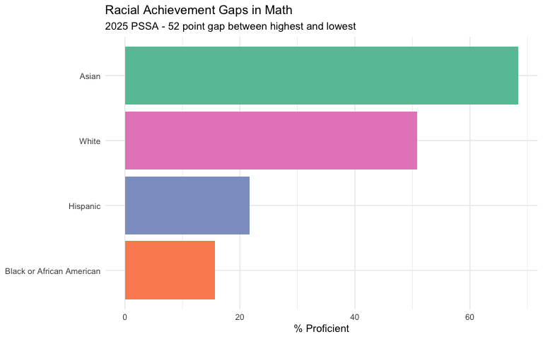
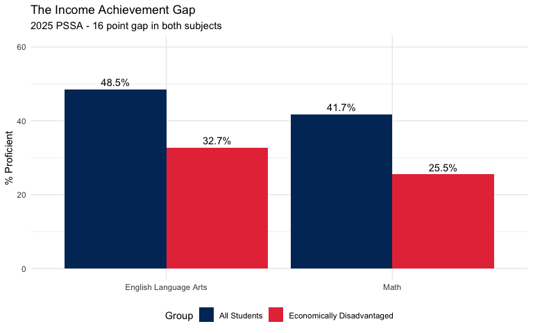
23. Economically disadvantaged students face a 16-point gap
Students from low-income families score 26% proficient in math, compared to the state average of 42%. The poverty gap is larger in ELA (16 points) than math (16 points).
econ_disadv <- pssa_state %>%
  filter(subject == "Math",
         group %in% c("All Students", "Economically Disadvantaged"),
         grade == "Total") %>%
  select(group, n_scored, pct_proficient_above)
stopifnot(nrow(econ_disadv) > 0)
econ_disadv
econ_gap_data <- pssa_state %>%
  filter(group %in% c("All Students", "Economically Disadvantaged"),
         grade == "Total")
stopifnot(nrow(econ_gap_data) > 0)

ggplot(econ_gap_data, aes(x = subject, y = pct_proficient_above, fill = group)) +
  geom_col(position = "dodge") +
  geom_text(aes(label = paste0(pct_proficient_above, "%")),
            position = position_dodge(width = 0.9), vjust = -0.5) +
  scale_fill_manual(values = c("All Students" = "#003366",
                                "Economically Disadvantaged" = "#e63946"),
                    name = "Group") +
  scale_y_continuous(limits = c(0, 60)) +
  labs(title = "The Income Achievement Gap",
       subtitle = "2025 PSSA - 16 point gap in both subjects",
       x = NULL, y = "% Proficient") +
  theme_minimal() +
  theme(legend.position = "bottom")